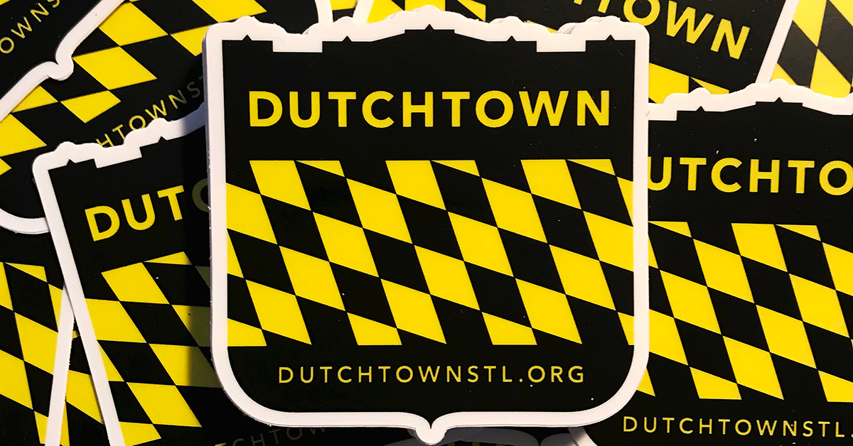
From the creation of DutchtownSTL.org, along with collaboration with neighborhood leaders, a need to develop a visual brand for the Dutchtown neighborhood became apparent.

The Dutchtown brand is derived from references to the Bavarian and German flags, signifying the German history of the neighborhood while paving a shining path to the future. The local historic architecture is incorporated into the branding as well.
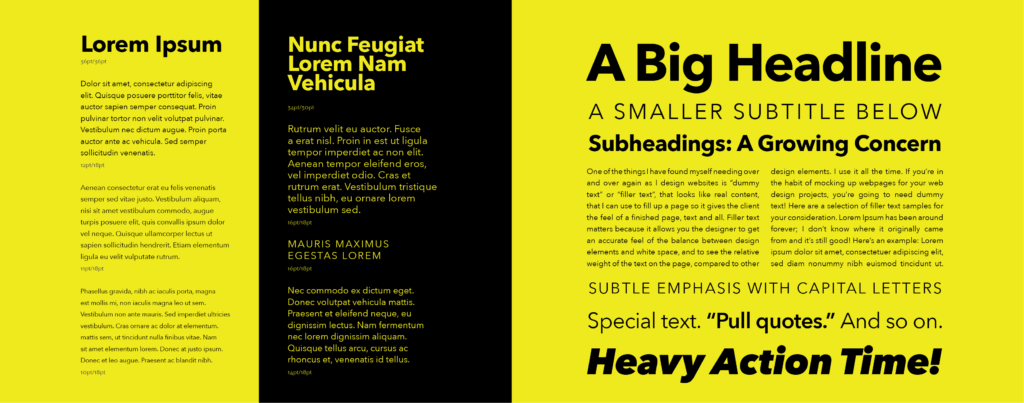
The typeface used in neighborhood materials was chosen to be highly versatile in a multitude of roles. Type can impart a serious, firm tone in official communications, a strong and steadfast image on yard signs, or an inviting and playful feeling on flyers for youth-oriented events.
As the Dutchtown neighborhood works to become more visible and relevant, the brand is flexible enough to meet new needs as they arise. We developed a complete brand strategy guide which is available upon request.